in 2026 having aMobile Responsive Web Design is essential to converting traffic into revenue. Mobile phones have changed how people use the internet. Today, most people browse websites on their phones instead of desktops or laptops. Because of this, mobile responsive web design has become one of the most important parts of building a website.
If your website does not work properly on a mobile phone, visitors will leave quickly. This can lead to fewer enquiries, fewer sales, and lower rankings on Google. Whether you are a small business or a growing brand, mobile responsiveness is essential for success online.
This guide explains everything you need to know about mobile responsiveness in a simple and clear way. You do not need any technical knowledge to understand it.
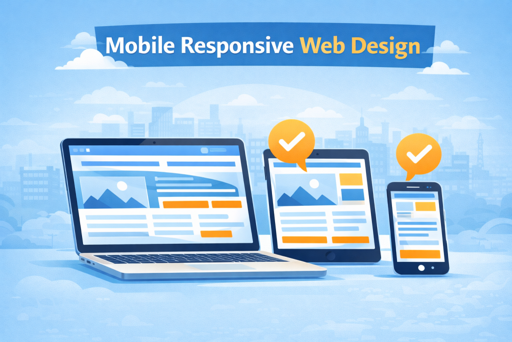
What Is Mobile Responsive Web Design?
Mobile responsiveness means your website automatically adjusts to fit different screen sizes. This includes mobile phones, tablets, laptops, and desktop computers.
A mobile responsive website will:
- Resize text so it is easy to read
- Adjust images so they fit the screen
- Move content into easy-to-scroll sections
- Make buttons large enough to tap with a finger
- Remove the need to zoom in or scroll sideways

When someone visits your website on their phone, the site should look clean, organised, and easy to use. They should not feel frustrated or confused.
For businesses investing in web design in Manchester, mobile responsiveness is no longer optional. It is a basic requirement.
How Mobile Responsive Web Design Has Changed Over Time
In the early days of the internet, websites were only designed for desktop computers. Mobile phones were not powerful enough to browse the web properly.
As smartphones became more popular, businesses started creating separate mobile websites. These were often basic and limited.
Today, responsive web design is the standard. Instead of having multiple versions of a website, one responsive website adapts to every device automatically. This approach is faster, easier to manage, and better for users.
Modern website design in Manchester focuses on mobile first design, meaning the website is planned for mobile screens before desktop screens.
Mobile Usage Facts You Should Know
Mobile usage continues to grow every year. Here are some important facts that show why mobile-friendly design is so important:
- Over 60 percent of all website traffic comes from mobile devices
- Most users check websites on their phone before making a decision
- People expect websites to load in under 3 seconds on mobile
- Users are more likely to trust a business with a modern mobile website
- Local searches like web design Manchester are mainly done on mobile
If your website is hard to use on a phone, people will leave and look for a competitor instead.
Why a Mobile Responsive Web Design Is Important for Your Business
Mobile design affects how people see your brand. Your website is often the first impression someone has of your business.
A poor mobile experience can:
- Make your business look unprofessional
- Increase bounce rates
- Reduce enquiries and sales
- Damage trust in your brand
A strong mobile-friendly website can:
- Keep users on your site longer
- Encourage contact form submissions
- Increase calls and messages
- Improve conversion rates
This is why professional web designers in Manchester always consider mobile design from the start.
Mobile Design and User Experience
User experience is how easy and enjoyable your website is to use. Mobile responsiveness plays a huge role in this.
Good mobile user experience includes:
- Clear navigation menus
- Easy-to-read text
- Simple layouts
- Fast loading pages
- Clear call to action buttons
If users enjoy using your website on mobile, they are more likely to trust your business and take action.
Mobile Editing on Popular Website Builders
Different website builders offer different levels of control over mobile layouts. Some platforms allow only basic edits, while others offer full flexibility.
Here is a clear comparison to help you understand the differences.
Mobile Editing Comparison Table
| Platform | Mobile Layout Control | Ease of Use | Design Flexibility | Best For |
|---|---|---|---|---|
| Wix | Basic mobile editor | Very easy | Limited | Small websites and startups |
| Shopify | Theme-based mobile layouts | Easy | Limited to themes | Online stores |
| WordPress (Themes) | Depends on theme | Medium | Moderate | Blogs and business sites |
| WordPress (Page Builders) | Separate mobile settings | Medium | High | Custom business websites |
| Custom Coded Websites | Full mobile control | Professional only | Very high | Professional web design |
Custom-coded websites offer the most control and best performance. This is why many businesses choose a professional web development agency in Manchester.
Mobile vs Desktop vs Tablet Usage
Understanding how people access websites helps explain why mobile design is so important.
| Device Type | Average Usage |
|---|---|
| Mobile | 60 to 65 percent |
| Desktop | 30 to 35 percent |
| Tablet | 5 to 10 percent |
Mobile users make up the largest group. A website that is not mobile friendly is ignoring most of its visitors.
How Mobile Responsive Web Design Affects Google Rankings
Google uses mobile-first indexing. This means Google looks at the mobile version of your website first when deciding how to rank it.
If your website:
- Is not mobile friendly
- Loads slowly on mobile
- Has hard-to-use navigation
- Displays broken layouts
Your rankings can drop. This can make it harder for customers to find you when searching for web design in Manchester or digital marketing services.
A mobile responsive website helps improve:
- Search engine rankings
- Page visibility
- Click-through rates
You can learn more about Google’s official guidance on mobile-friendly websites here:
https://developers.google.com/search/mobile-sites/mobile-first-indexing
Mobile Responsiveness and SEO
Search engine optimisation works best when your website is mobile friendly.
Mobile responsiveness helps SEO by:
- Reducing bounce rates
- Improving time spent on site
- Making content easier to read
- Helping pages load faster
- Improving internal linking
Google wants to show users the best possible results. A responsive website sends positive signals that your site is helpful and user friendly.
Site Speed and Mobile Performance
Site speed is how fast your website loads. Mobile users expect fast websites.
Slow mobile websites cause:
- Frustration
- High bounce rates
- Lower conversions
- Poor search rankings
Responsive web design helps improve speed by:
- Optimising images
- Reducing unnecessary content
- Using clean layouts
- Improving mobile loading performance
Professional website developers in Manchester focus heavily on speed when building responsive websites.
Why User Friendly Design Matters
User friendly websites are simple and easy to understand.
Mobile-friendly websites should:
- Use clear language
- Avoid clutter
- Have clear buttons
- Guide users step by step
When visitors feel comfortable using your site, they are more likely to contact you or make a purchase.
The Web Development Process with Mobile in Mind
A strong responsive website follows a clear development process.
1. Initiation
Understanding your business goals, audience, and competitors.
2. Planning
Mapping out the site structure and mobile layouts.
3. Design
Creating mobile-first designs that work on all screen sizes.
4. Development
Building responsive layouts using clean code and modern tools.
5. Testing
Testing the site on phones, tablets, and desktops.
6. Deployment
Launching a fully responsive website ready for real users.
Skipping mobile planning at any stage can lead to problems later.
Why Web Design and Mobile Responsiveness Go Hand in Hand
Web design is not just about how a website looks. It is about how it works.
Modern web design in Manchester focuses on:
- Mobile-first layouts
- Simple navigation
- Clear content
- Strong calls to action
- Fast performance
A responsive web design agency understands how to balance design, usability, and performance across all devices.
Common Mobile Design Mistakes to Avoid
Some common mistakes include:
- Text that is too small
- Buttons that are hard to tap
- Images that do not scale
- Slow loading pages
- Pop-ups that block content
Avoiding these mistakes improves user experience and results.
Why Mobile Responsiveness Is Vital When Building a Website
When building a website, mobile responsiveness must be a priority from the start.
Without mobile responsiveness, you risk:
- Losing visitors
- Lower Google rankings
- Missed enquiries
- Poor brand perception
Responsive design helps future-proof your website and ensures it works well for years to come.
Choosing the Right Responsive Web Design Agency
Not all agencies approach mobile design the same way.
A good responsive web design agency will:
- Design mobile first
- Test across devices
- Focus on speed and usability
- Build with SEO in mind
- Provide long-term support
Choosing the right agency can make a huge difference to your online success.
Call to Action: Work With a Responsive Web Design Agency
If your website is outdated or not mobile friendly, now is the time to improve it.
As a responsive web design agency in Manchester, we create mobile-first websites that are fast, user friendly, and built to rank well on Google.
Whether you need a new website or a redesign, our web design and development team can help your business grow online.
Contact us today to discuss professional web design in Manchester and discover how mobile responsiveness can transform your website.